ShopDreamUp AI ArtDreamUp
Deviation Actions


Suggested Deviants


Suggested Collections


You Might Like…


Featured in Groups


Description
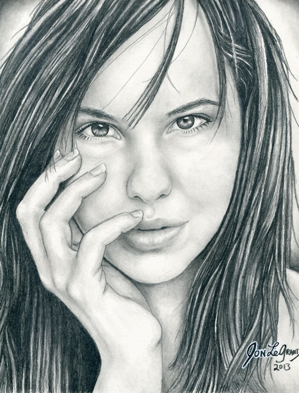
Here is another try at drawing my friend  , the first one I was not satisfied with, I hope this one looks better, I like it anyway! Mostly, I hope you like it Sara!
Here is the ref I used:
 Sara has a great gallery, go see!
Image size
2477x3251px 2.38 MB
© 2013 - 2024 Legrandzilla
Comments31
Join the community to add your comment. Already a deviant? Log In
Hello! very nice portrait! not only is your pencil work very controlled but the image of your friend itself is a very nice shot for a portrait. I think the strongest part of this drawing is the facial area, particularly the eyes. The eyes show a clear attention to detail, I love the little highlights within!
Now for some pointers- I believe the hands in this drawing are suffering from what I like to call "outline syndrome", which is characterized by the obvious use of line to create differentiation in space. Based on the beautiful shading you have used on the face I would have loved to see you use the shading to create the hand (mostly the fingers) because the lines are a bit too pronounced and clash with the face. This is a small detail, but when you look closely it will be apparent.
Secondly, the hair is well drawn but the level of technique used in the hair doesn't quite meet up with your shading skill. Maybe you could try using longer pencil strokes? the main thing I see that is obstructing the hair is the "piecey" look it has because of short pencil strokes. Hair is a very difficult spot to draw, you should feel great about this regardless!
And lastly, I am going to be critical of something that I have been having a problem with in my own recent drawings- Complete Balance of Values. Notice how there are really isn't a single place on the paper where the blackest of blacks is used? (sorry if it is taken down in value by a scanner problem). Its interesting, the darkest spot that instantly sticks out to me is your signature! You have a very good concept of light and medium values, but just like most pencil artists you could explore more variety of dark's to create the most vibrant portraits.
Awesome job!
-Brandon Kreuder